Image Elements
An image element draws a rectangle: a solid color, a texture, or a frame of a sprite. Panels, backgrounds, icons, buttons and masks are all image elements.
Color and Opacity
color tints the image. The colors of a texture are multiplied by it, so a white or grayscale texture can be drawn in any color, and an image without a texture is a rectangle of that color. opacity sets how transparent the image is, from 0 to 1. The alpha of color is ignored, so use opacity instead.
To change them from code, assign a new pc.Color:
panel.element.color = new pc.Color(0.23, 0.55, 1);
panel.element.opacity = 0.8;
The color and opacity of an element don't affect its children. See Group Elements.
Textures
Give an image element a texture asset to draw an image:
- Engine
- Editor
- React
- Web Components
const icon = new pc.Entity('icon');
icon.addComponent('element', {
    type: pc.ELEMENTTYPE_IMAGE,
    anchor: [0.5, 0.5, 0.5, 0.5],
    pivot: [0.5, 0.5],
    width: 128,
    height: 128,
    textureAsset: iconTexture.id
});
screen.addChild(icon);
iconTexture is a texture asset that you have added to app.assets and loaded. To use a pc.Texture object instead, set texture.
Drag a texture asset onto the image element's Texture field.
import { Entity } from '@playcanvas/react';
import { Element } from '@playcanvas/react/components';
import { useTexture } from '@playcanvas/react/hooks';

export function Icon() {
  const { asset: texture } = useTexture('textures/icon.png');
  if (!texture) return null;

  return (
    <Entity name="icon">
      <Element type="image" anchor={[0.5, 0.5, 0.5, 0.5]} pivot={[0.5, 0.5]}
        width={128} height={128} textureAsset={texture} />
    </Entity>
  );
}
<pc-asset id="icon" src="textures/icon.png"></pc-asset>

<pc-entity name="icon">
    <pc-element type="image" anchor="0.5 0.5 0.5 0.5" pivot="0.5 0.5"
                width="128" height="128" texture-asset="icon"></pc-element>
</pc-entity>
Declare the <pc-asset> inside <pc-app>, and the <pc-entity> below a screen.
An image shows either a texture or a sprite. Assigning a texture asset clears the sprite asset, and assigning a sprite clears the texture asset.
Fitting a Texture
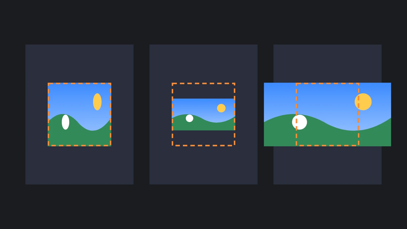
A texture fills its element, stretched to the element's shape. Fit Mode keeps the texture's aspect ratio instead:
| Fit Mode | The texture is |
|---|---|
| Stretch | Stretched to fill the element. This is the default |
| Contain | Scaled to fit inside the element, leaving space at its sides or above and below it |
| Cover | Scaled to cover the element, overflowing its sides or its top and bottom. Crop the overflow with a mask |
A contained or covering texture is placed at the element's pivot: a centered pivot centers it, and a pivot in a corner aligns it to that corner. Set fitMode to pc.FITMODE_STRETCH, pc.FITMODE_CONTAIN or pc.FITMODE_COVER in the Engine, use the fitMode prop in React, and the fit-mode attribute in Web Components.
Part of a Texture
rect draws part of a texture, given as the u, v, width and height of the part in fractions of the texture, from 0, 0 at its bottom-left corner. The default of 0, 0, 1, 1 draws all of it:
// The top-left quarter of the texture
icon.element.rect = new pc.Vec4(0, 0.5, 0.5, 0.5);
For many images packed into one texture, a texture atlas and sprites are easier to manage.
Sprites
A sprite is a set of frames from a texture atlas, a texture with named rectangles on it. Assign a sprite asset to an image element to draw its first frame, and set spriteFrame to pick another. Sprites also add render modes that keep the borders of a frame crisp at any size.
9-Sliced and Tiled Sprites
A sprite whose render mode is Sliced keeps the borders of its frame at a fixed size, and stretches the rest to the size of the element. Tiled repeats the rest instead of stretching it. One small image then makes panels, buttons and frames of any size. See 9-Slicing for how the borders of a frame are defined.
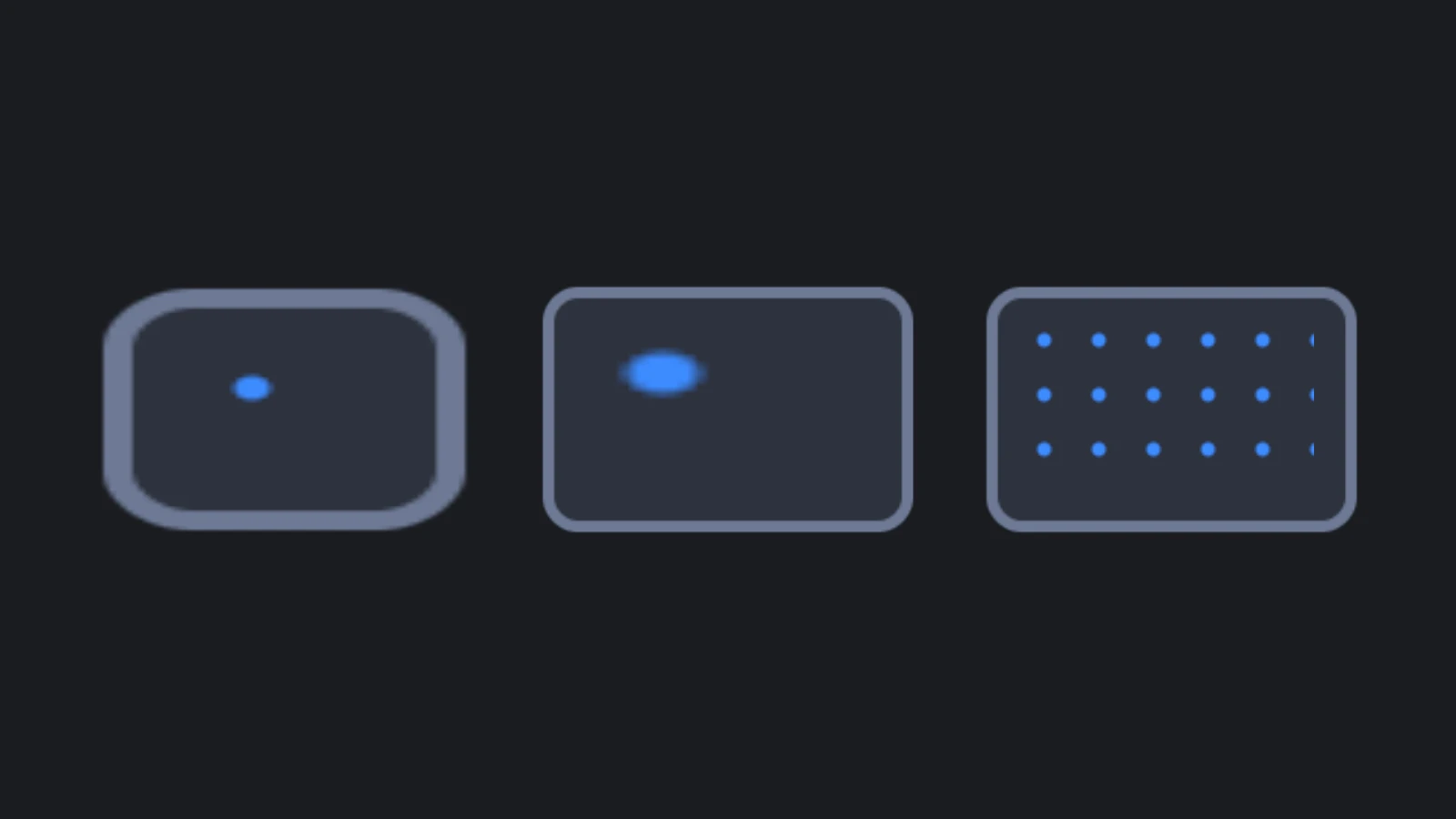
A border of b pixels is b / pixelsPerUnit screen units wide. Pixels Per Unit is the sprite's, unless the image element sets its own, so a sprite with 1 pixel per unit draws a 16 pixel border 16 units wide. When the element is too small for its two borders, the borders shrink to fit.
- Engine
- Editor
- React
- Web Components
// A texture atlas with one 64 x 64 frame, whose 16 pixel borders keep their size
const atlas = new pc.TextureAtlas();
atlas.texture = panelTexture.resource;
atlas.frames = {
    panel: {
        rect: new pc.Vec4(0, 0, 64, 64),
        pivot: new pc.Vec2(0.5, 0.5),
        border: new pc.Vec4(16, 16, 16, 16)
    }
};
const sprite = new pc.Sprite(app.graphicsDevice, {
    atlas,
    frameKeys: ['panel'],
    pixelsPerUnit: 1,
    renderMode: pc.SPRITE_RENDERMODE_SLICED
});

const dialog = new pc.Entity('dialog');
dialog.addComponent('element', {
    type: pc.ELEMENTTYPE_IMAGE,
    anchor: [0.5, 0.5, 0.5, 0.5],
    pivot: [0.5, 0.5],
    width: 400,
    height: 240,
    sprite
});
screen.addChild(dialog);
A frame's rect is its x, y, width and height in pixels, from the bottom-left corner of the texture, and its border is in the order left, bottom, right, top. With a sprite asset, set spriteAsset instead of sprite.
In the Sprite Editor, set the borders of a frame and click New Sliced Sprite From Selection. Then drag the new sprite asset onto the image element's Sprite field.
useAsset does not load texture atlases or sprites, so build them from a texture:
import { useEffect, useState } from 'react';
import { SPRITE_RENDERMODE_SLICED, Sprite, TextureAtlas, Vec2, Vec4 } from 'playcanvas';
import { Entity } from '@playcanvas/react';
import { Element } from '@playcanvas/react/components';
import { useApp, useTexture } from '@playcanvas/react/hooks';

export function Dialog() {
  const app = useApp();
  const { asset: texture } = useTexture('textures/panel.png');
  const [sprite, setSprite] = useState(null);

  // A texture atlas with one 64 x 64 frame, whose 16 pixel borders keep their size. The sprite
  // owns meshes on the GPU, so it is created in an effect and destroyed with the dialog
  useEffect(() => {
    if (!texture) return;
    const atlas = new TextureAtlas();
    atlas.texture = texture.resource;
    atlas.frames = {
      panel: { rect: new Vec4(0, 0, 64, 64), pivot: new Vec2(0.5, 0.5), border: new Vec4(16, 16, 16, 16) }
    };
    const panelSprite = new Sprite(app.graphicsDevice, {
      atlas, frameKeys: ['panel'], pixelsPerUnit: 1, renderMode: SPRITE_RENDERMODE_SLICED
    });
    setSprite(panelSprite);
    return () => {
      setSprite(null);
      panelSprite.destroy();
    };
  }, [app, texture]);

  if (!sprite) return null;

  return (
    <Entity name="dialog">
      <Element type="image" anchor={[0.5, 0.5, 0.5, 0.5]} pivot={[0.5, 0.5]}
        width={400} height={240} sprite={sprite} />
    </Entity>
  );
}
<pc-asset id="panel-sheet" type="textureatlas" src="textures/panel.png"
          data='{"frames":{"panel":{"rect":[0,0,64,64],"pivot":[0.5,0.5],"border":[16,16,16,16]}}}'></pc-asset>
<pc-asset id="panel" type="sprite" atlas="panel-sheet" frame-keys="panel" render-mode="sliced"></pc-asset>

<pc-entity name="dialog">
    <pc-element type="image" anchor="0.5 0.5 0.5 0.5" pivot="0.5 0.5"
                width="400" height="240" sprite-asset="panel"></pc-element>
</pc-entity>
Declare the texture atlas before the sprite that uses it. See <pc-asset>.
Rendering 3D into an Image
A camera can render into a texture that an image element shows, for character portraits, item previews and minimaps. Give that camera a layer of its own, holding only what it should see, and render it before the main camera:
// The texture to render into
const previewTexture = new pc.Texture(app.graphicsDevice, {
    width: 512,
    height: 512,
    format: pc.PIXELFORMAT_SRGBA8,
    mipmaps: false
});
const renderTarget = new pc.RenderTarget({
    colorBuffer: previewTexture,
    depth: true,
    origin: pc.RENDERTARGET_ORIGIN_TOP
});

// A layer for what the preview camera sees, which the main camera does not render
const previewLayer = new pc.Layer({ name: 'Preview' });
app.scene.layers.push(previewLayer);

const previewCamera = new pc.Entity('preview camera');
previewCamera.addComponent('camera', {
    layers: [previewLayer.id],
    renderTarget,
    priority: -1,
    clearColor: new pc.Color(0, 0, 0, 0)
});
previewCamera.setPosition(0, 0.5, 3);
previewCamera.lookAt(model.getPosition());
app.root.addChild(previewCamera);

// Put the model on the preview layer, and show the texture in the interface
model.render.layers = [previewLayer.id];
portrait.element.texture = previewTexture;
The camera's priority of -1 renders it before the main camera, which has a priority of 0, so the texture is ready when the interface is drawn. The transparent clear color leaves the background of the image transparent. Keep the texture's sRGB format, pc.PIXELFORMAT_SRGBA8: with pc.PIXELFORMAT_RGBA8, the image comes out too light. An origin of pc.RENDERTARGET_ORIGIN_TOP stores the image top row first, as image textures are, so that it is the right way up on both WebGL2 and WebGPU. Without it, the image is upside down on WebGL2. The origin option is available from engine 2.22.
Custom Materials
An image element draws with a default material that uses its color, opacity and texture. To draw it with a material of your own, for a gradient or a shader effect, assign it to material, or to the Material field in the Editor. The material replaces the default one, along with its handling of the element's color, opacity and texture.
The UI layer draws only transparent materials, so a material must blend to show up there:
const material = new pc.StandardMaterial();
material.useLighting = false;
material.emissive = new pc.Color(1, 0.55, 0.2);
material.blendType = pc.BLEND_NORMAL;
material.depthWrite = false;
material.update();

panel.element.material = material;
A material that doesn't blend, which is the default for a new material, is never drawn on the UI layer. Turn lighting off for materials on screen-space screens, which the scene's lights don't light in any useful way.
Avoiding Dark Edges
A texture with transparent areas, such as a round icon, can show a thin dark or light fringe around its edges. The pixels of a transparent area still have a color, usually black or white, even though you can't see it, and when the texture is drawn at another size, filtering blends that color into the visible pixels at the edges.
Fix it in the image, not in the engine: fill the color of the transparent pixels with the color of the nearest visible pixels, leaving their alpha untouched. Many image editors and texture tools can do this, often under the name alpha bleeding, texture padding or dilation.
See Also
- Masks - Clipping children to an element's rectangle or shape
- Buttons - Changing an image's tint or sprite on hover and press
- 9-Slicing and Sprite Editor - Creating sprites and their borders in the Editor
- Element Component,
<pc-element>and ElementComponent - Reference for every image property